How to create mood and expression with colour
Colour is a powerful tool in interior design. Through different shades, contrasts and materials, you can shape a space – from calm and focus to energy, depth and warmth – and give it a clear identity.
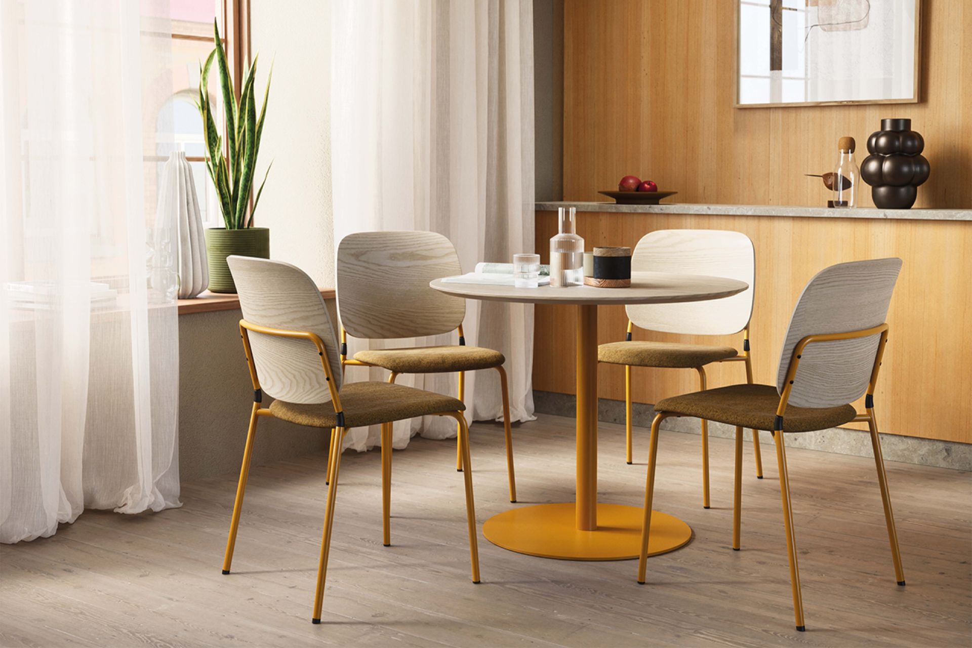
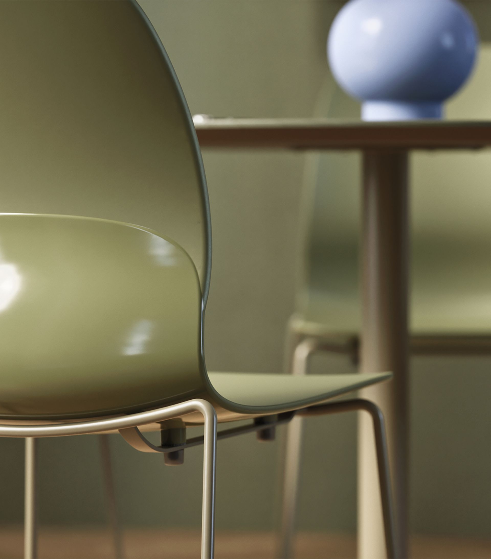
Warm, earthy tones contribute to environments that feel both calm and vibrant.
Starting with how a space is intended to be used and experienced makes it easier to make informed colour choices. At the same time, it is rarely about a single colour, but rather how colours interact and support each other. A cohesive scheme is often built on a dominant base, a supporting tone and an accent that enhances the overall impression. After years of pared-back, neutral palettes, we are now seeing a shift towards warmer, more earthy tones – where a few expressive accents are also allowed to stand out. Soft browns meet light blues, while greens, purples, yellows and oranges contribute to environments that feel both calm and vibrant.
Warm or cool?
When we talk about warm and cool colours, it often comes down to perception. Red, orange and yellow feel lively and energising, while cooler tones such as blue, green and purple are more subtle and can have a calming effect. When combined, warm and cool tones create a natural sense of balance and movement. A warm base can, for example, be offset by cooler elements – or the other way around.
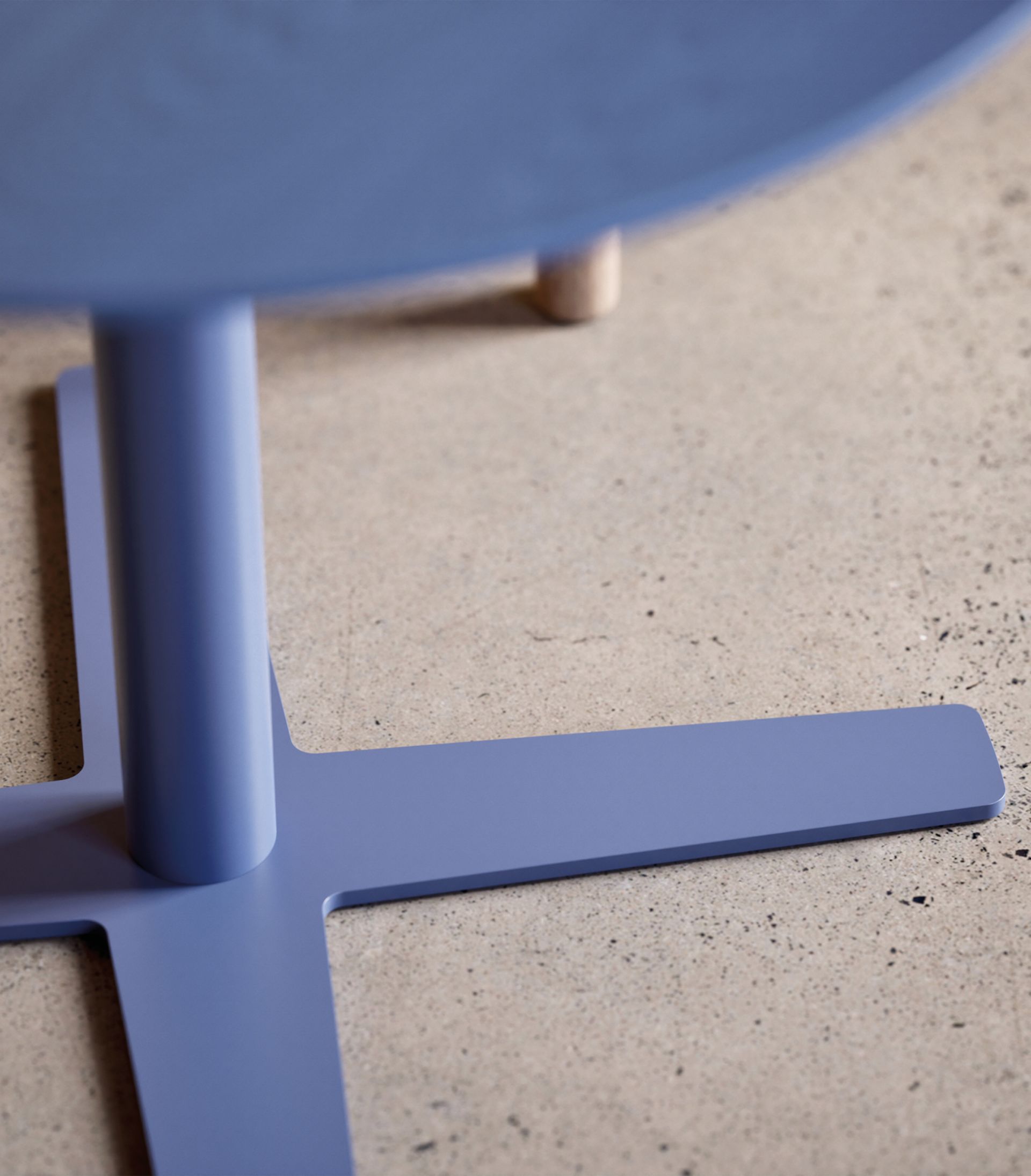
When soft browns meet cooler light blues, a natural dynamic emerges.
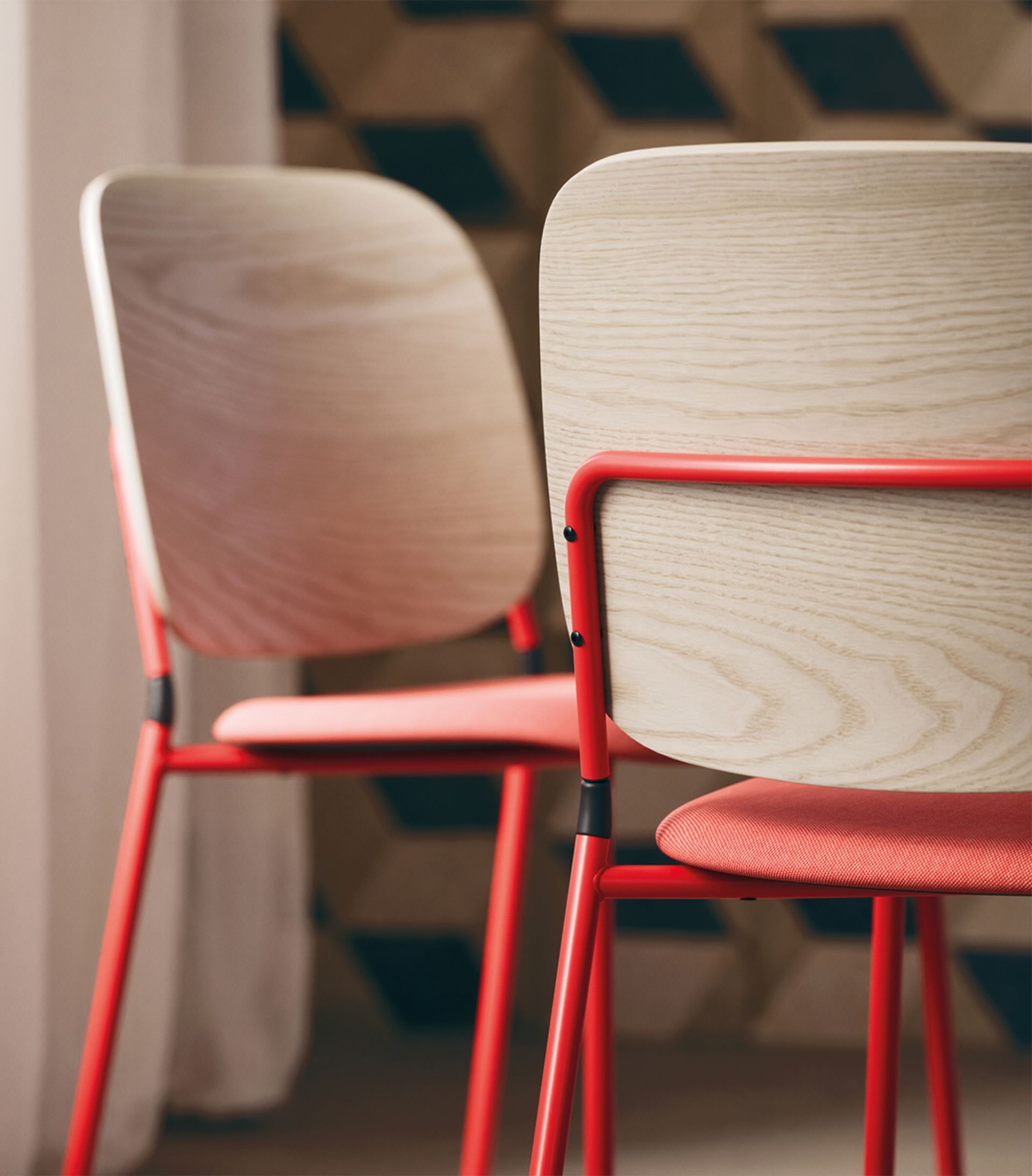
A monochrome colour scheme creates a harmonious expression across larger surfaces.
Monochrome palettes create harmony
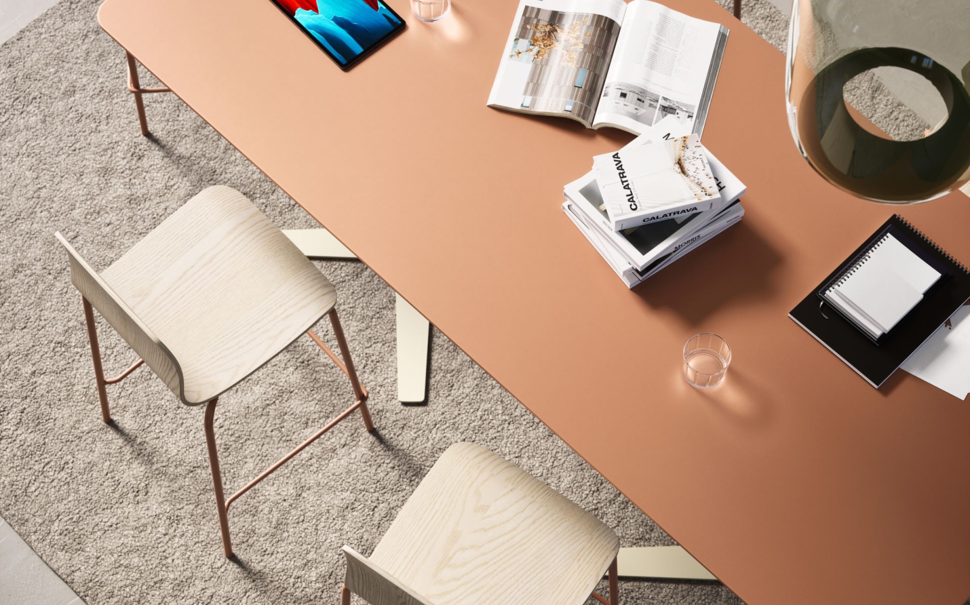
Working tone-on-tone with different shades of the same colour can create a refined and harmonious expression across larger surfaces. Materials also play an important role, as the same colour can appear differently in textiles, wood or lacquered finishes. Combining surfaces and textures adds variation and depth – even within a monochrome palette.
The same colour can appear differently depending on the material.
Energy, depth or focus through contrast
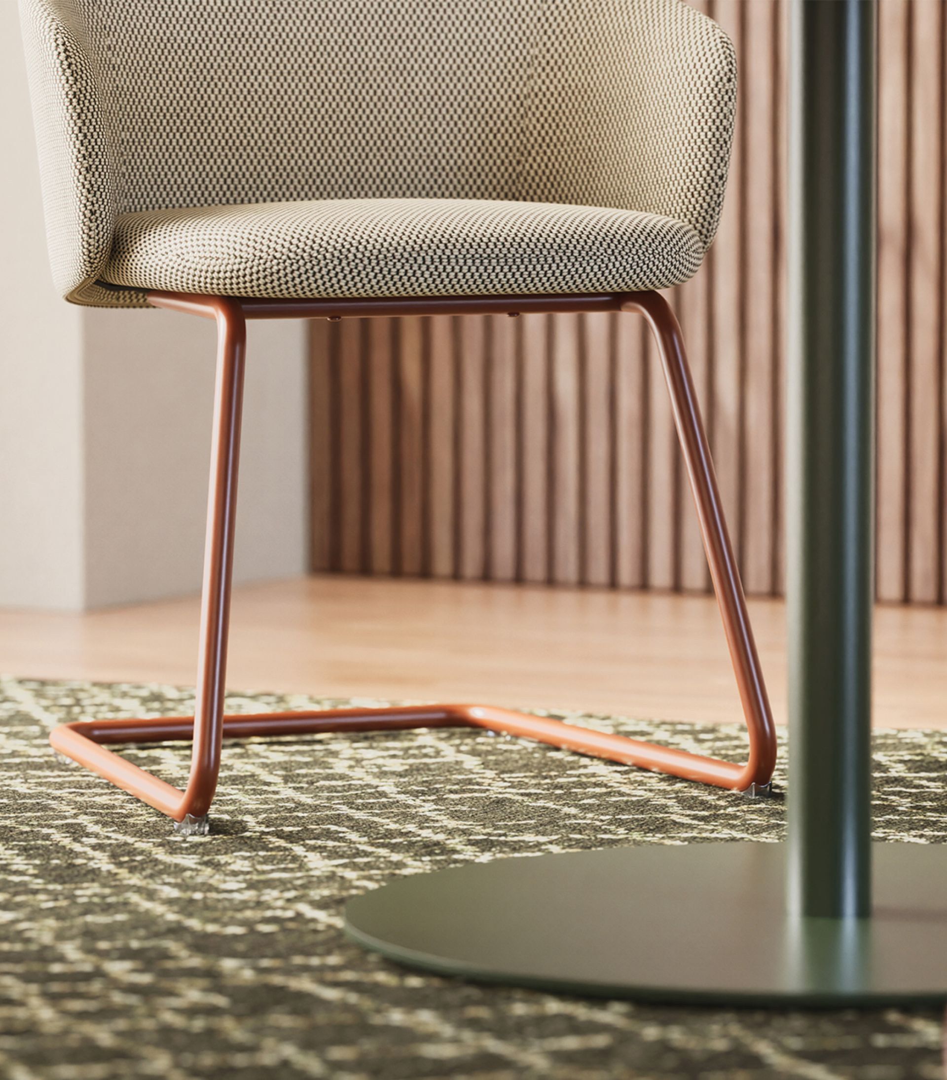
Contrast can bring energy into a space – and it does not have to be bold to make an impact. It can be as simple as introducing a red accent into a neutral setting, drawing the eye and adding depth and character without dominating the room. Let colour take its place where it makes a difference – in a chair, a table, a wall or a detail. Complementary colours, positioned opposite each other on the colour wheel, such as orange and blue or yellow and purple, also create engaging contrasts.
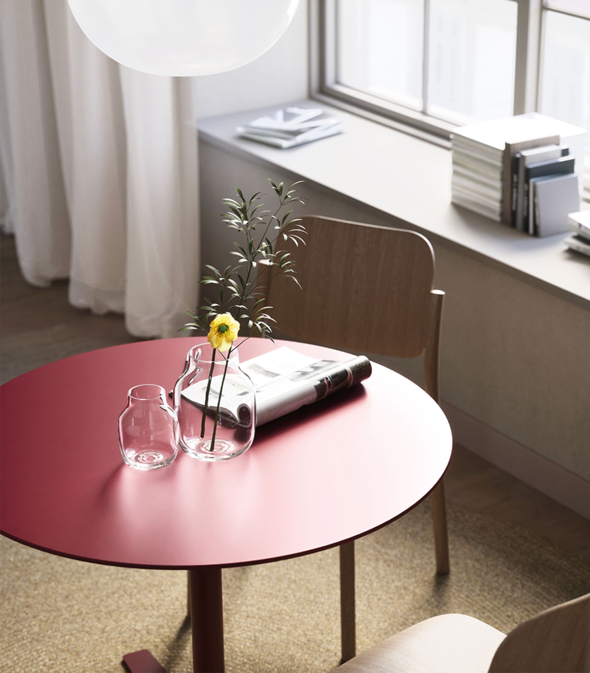
Red is an energising colour that creates a welcoming atmosphere and works well in dining and café areas.
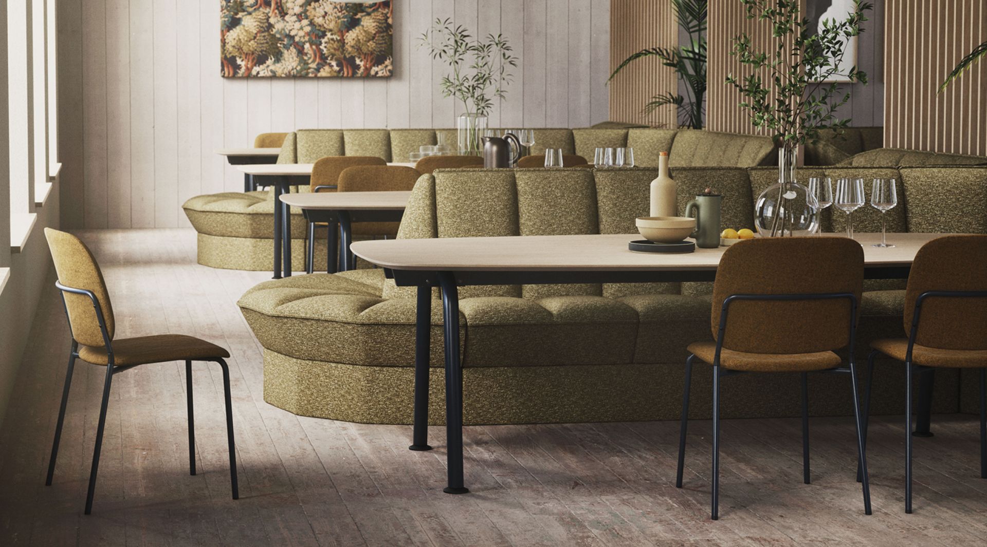
Contrast can also support concentration. Green tones often evoke nature, balance and recovery, making them well suited to environments where focus is needed without the space feeling too minimal.
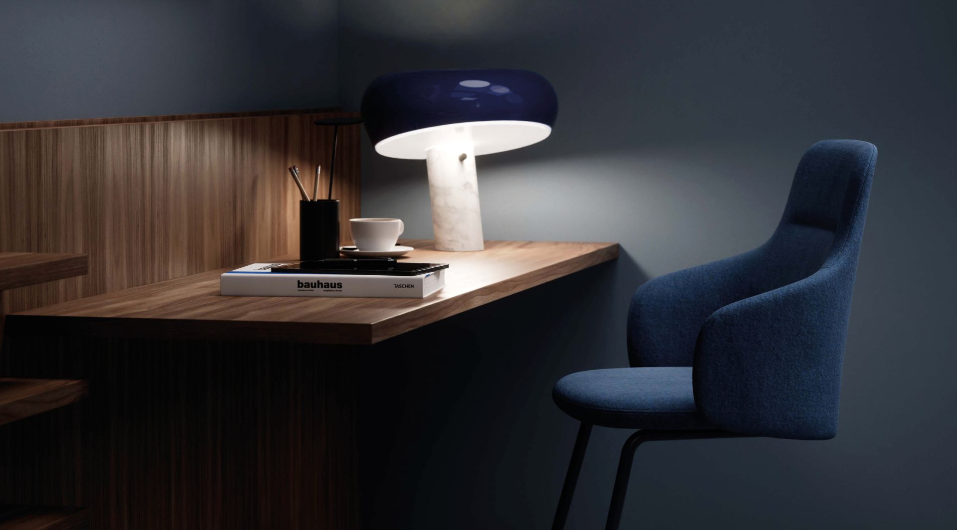
Reco in a darker colour scheme creates a more intimate atmosphere.

Light and dark shape the experience of space
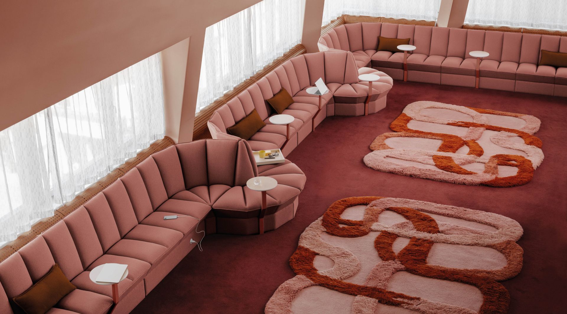
Colour influences how we perceive space and proportions. Lighter tones can open up a room and make it feel more spacious and airy, while deeper, darker colours create a more intimate and enclosed atmosphere. In larger spaces, subtle shifts in tone between different zones can add perspective and a clearer sense of depth – for example by using darker shades further into the room.
Appoint in lighter tones helps the entire space feel more open and airy.
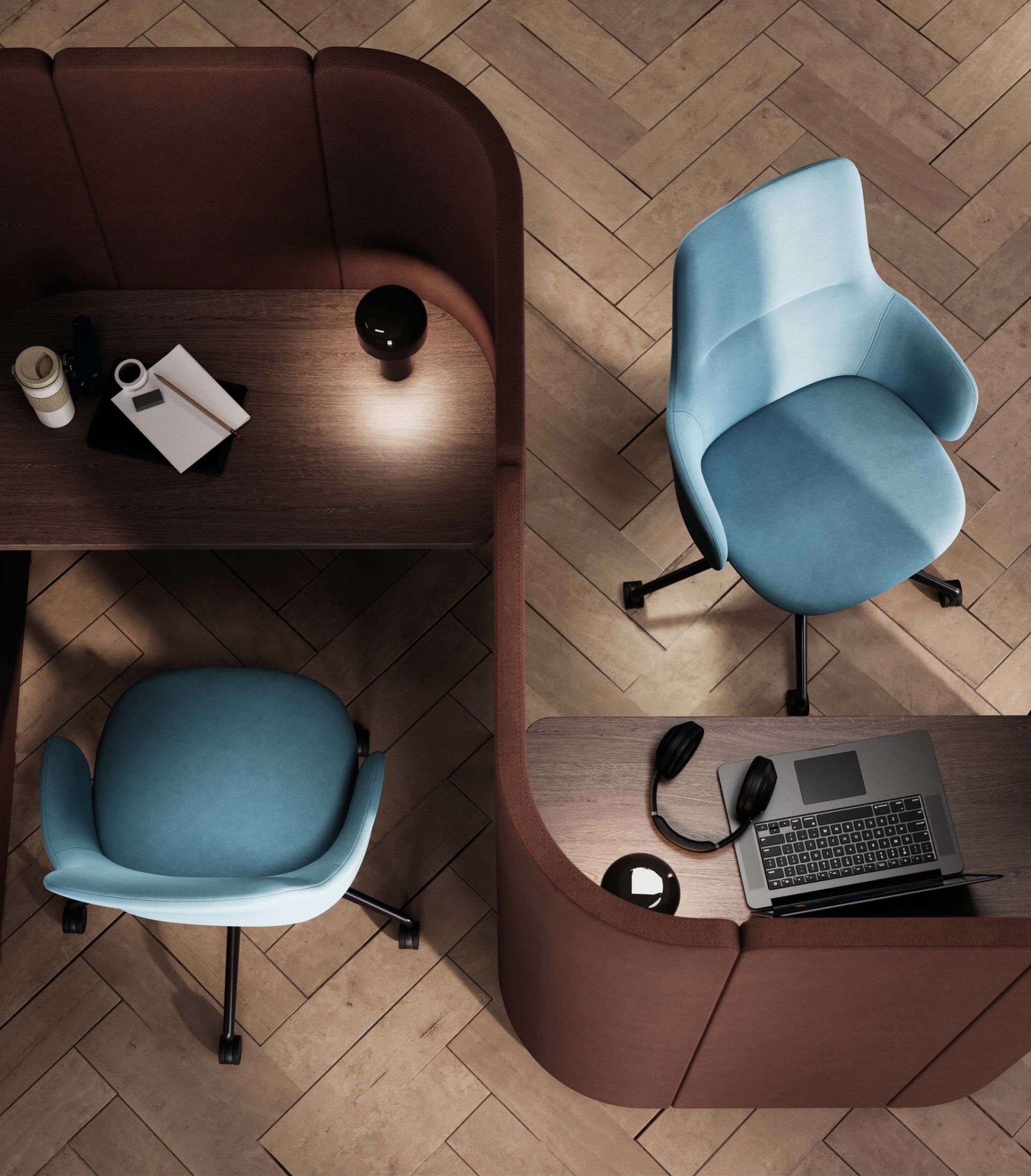
Visual rest in screen-intensive environments
In environments with many screens, colour becomes especially important. The aim is to avoid strong contrasts that compete with screen light and strain the eye. Neutral and muted tones often work well to create balance. Green hues can support recovery, while blue tones promote calm and relaxation. Combined with natural materials such as wood, the overall expression becomes softer.
Neutral and muted tones create balance in screen-intensive environments.
Many possibilities for designing with colour
With a wide range of materials, textiles and RAL Classic colours for metal components, EFG offers many ways to work with colour – from subtle, muted tones to more expressive accents. This makes it possible to create environments with a clear and considered identity, while still allowing them to evolve over time.
We offer a wide range of materials, textiles and RAL Classic colours to create environments with a clear identity.
A toned-down colour scheme creates a sense of calm across larger surfaces.